Opinions please

CAOX3

Forum Deputy Chief
1,366
4
0
Hello,

My name is TC and I work in the EMS field. I am also a freelance Graphic designer. I have been designing now for about 3 years now.

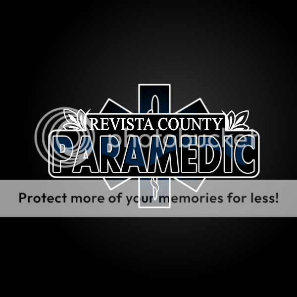
I was recently approached to design a brand for an EMS system. I have done some fire department brands, however this is my first EMS Brand.

I would like some opinions on the design if possible. Honest opinions please. I can take criticism, so be honest.

I have about one month left to finish creating the design. This one will be a door decal


REVISTACOUNTY.png

Here are two more that I need to finish in the next week. The ladder 1 is a t-shirt and the fd one will be their window stickers

LADDER1.png


ISLANDCITY.png

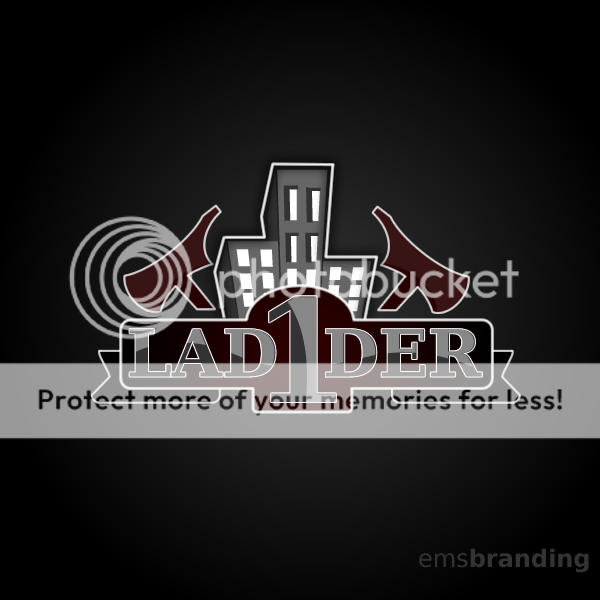
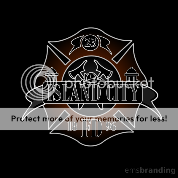
Obviously I had to change the names because we are under contract. Honest opinions The ladder 1 t-shirt has already been approved. Just needs finishing touches.

Let me know what you think.

Thanks.
 
OP
OP
C

CAOX3

Forum Deputy Chief
1,366
4
0
Wow, not one comment.
 

tydek07

Forum Captain
462
12
18
They all look real good :D No complaints from me.
 
OP
OP
C

CAOX3

Forum Deputy Chief
1,366
4
0
Thanks tydek
 

karaya

EMS Paparazzi
Premium Member
703
9
18
The EMS (the first example) logo might look a little better if we could see just a little more of the staff and serpent. Just a little so the Star of Life doesn't get completely obscured to a point one has to look twice. They all look very good!
 

exodus

Forum Deputy Chief
2,895
242
63
Can you remove the background gradient, and make it all white, or whatever color the rig is?
 

Mountain Res-Q

Forum Deputy Chief
1,757
1
0
I've done some amature stuff like this for t-shirt designs and all I can say is that they are WAY BETTER than anything I have made!!! The only thing I will say is that thre is no contrast with the black background and the reds and blues in the lettering. The ones that are meant for the sides of rigs might need to be more "In Your Face" for visual purposes. NICE WORK. I'll take two in XL.
 
OP
OP
C

CAOX3

Forum Deputy Chief
1,366
4
0
Thanks

I appreciate all the comments.

I guess I just needed some outside opinions.

Thanks again.
 
OP
OP
C

CAOX3

Forum Deputy Chief
1,366
4
0
Im going to start mocking up the ambulance(sprinter), Ill show the pics when im finished to get some feedback

Thanks again.
 

lightsandsirens5

Forum Deputy Chief
3,970
19
38
The EMS (the first example) logo might look a little better if we could see just a little more of the staff and serpent. Just a little so the Star of Life doesn't get completely obscured to a point one has to look twice. They all look very good!

Yea, waht he said. Also, will the background be a black square, or will the emblem havw the vehicle color as a backdrop.

Other than that, I love 'em! Wish I was smart enoug to do stuff like that!:p
 

BuddingEMT

Forum Probie
28
0
1
The third one may need a change in the color of the letters since the gray seems to wash out the graphic a little. The other two are great! The first one is amazing! Seriously, you have a talent.
 

micsaver

Forum Crew Member
65
0
0
Excellent job! my first thought on the EMS design though is that the Star of Life is almost completely hidden making in seem really unimportant. I think it would be a very important part of EMS/PARAMEDIC recognition and, thus should be more prominent.
 

phabib

Forum Lieutenant
125
0
0
Great design. I have pretty much the same feedback, just make "Paramedic" a little shorter so that more of the star shows.
 
OP
OP
C

CAOX3

Forum Deputy Chief
1,366
4
0
Here is a rough draft of the chase car. Still have a few things to do.

Tell me hat you think.

Thanks

CHASECR.png
 

Mountain Res-Q

Forum Deputy Chief
1,757
1
0
NICE! I'll take two on my Jeep!

The only think I still say as that there is no "in your face" factor. Maybe turn the PARAMEDIC silver or some other contrasting color or try making it comletely blue insted of that black/blue combo.
 
OP
OP
C

CAOX3

Forum Deputy Chief
1,366
4
0
Im trying all the ideas now just messing with it, see what it looks like.

Thanks again
 

Ridryder911

EMS Guru
5,923
40
48
I like the design but I suggest in lieu of Supervisor title, EMS Command so in the case of MCI, or use of ICS is recognized. This allows those of higher or equal the opportunity to be recognized.

Maybe the name in red or something distunguishing the area it represents.. good graphics though.

R/r 911
 

TransportJockey

Forum Chief
8,623
1,675
113
I think it looks really good on the chase car. Might wanna change to 'Paramedic' lettering to silver and see how it looks. I like all of them
 
OP
OP
C

CAOX3

Forum Deputy Chief
1,366
4
0
Thanks.

Im going to play around with some other colors for paramedic.

I am also trying to get in touch with him to see if likes the EMS command better.

Thanks again guys.

Ill try to post some revisions later.
 

8jimi8

CFRN
1,792
9
38
on the first image,

i don't like that the "paramedic" is so opaque.

i would like to be able to see the star of life, so either overlay it translucent over the paramedic, or bend paramedic underneath the star.

just my 2 cents
 
Top